Drip, & Pour! Exploring the Impact of Viral Process Painting Using Animated Data Visualization as Art Education Research
On social media, art educators share glimpses into their classroom ecologies—from art projects, to classroom management tips, to cost-effective solutions for specialized tools, materials and more. Recently, process-based artmaking methods like “pour painting”, in which paint is poured directly onto a canvas using different colors, have gone viral on sites such as Pinterest, TikTok, and Instagram (Figure 1). Considering the need for art teachers to make use of data deluges circulating online (Klein, 2014), this research explores the prevalence and popularity of pour painting techniques on social media using animated data visualization as an art education research tool. Using a custom systematic sampling approach, data was mined from 150 Instagram posts of pour paintings shared by art education influencers, DIY communities, as well as A.I. generated images.
To animate the data, morphing effects were applied to each image sequentially, serving as a means for layered image comparison to help identify variations in the viral pour paintings (Figure 1). Specifically, this study assessed the impact of the “mere-exposure effect”, or, the development of preference for certain aesthetics and art making practices based on repeated exposure to them (Nanay, 2017). To this end, this research postulates that repeated exposure to pour painting techniques posted on social media primes teachers to be inspired to shift the focus from the artwork as a final product back to the process of art making. This is significant as encouraging this gravity-driven approach to painting in the classroom can be more accessible to a variety of grade levels, providing students who are timid about art making with an inviting means to experience the space between control and vulnerability. The resulting data visualization echoes the organic nature of pour painting, and although findings indicate that these artworks are highly derivative, exposure to pour paintings opens opportunities to rethink art making in K-12 classrooms by emphasizing process-based studio habits as form of generative knowledge.

References:
Klein, S. R. (2014). Making Sense of Data in the Changing Landscape of Visual Art Education. Visual Arts Research, 40(2), 25–33. https://doi.org/10.5406/visuartsrese.40.2.0025
Nanay, B. (2017). Perceptual Learning, the Mere Exposure Effect and Aesthetic Antirealism. Leonardo, 50(1), 58–63. https://www.jstor.org/stable/26808357
Figure 1. From left to right: Screenshots of TikTok, Pinterest, and Instagram content after entering the key words “pouring art” into the search engines.
Chicago Animation: "Shared Thoughts & Conversations About Choice." 2022-23. Animated Data Visualization. Collaboration with Ellen Sandor & (art)n, Diana Torres & Azi Gholizadeh. Duration: 1 min 45 sec.
Houston Animation: "Shared Thoughts & Conversations About Choice." 2022-23. Animated Data Visualization. Collaboration with Ellen Sandor & (art)n, Diana Torres & Azi Gholizadeh. Duration: 1 min 45 sec.
For this project, Art-Based Research (ABR) and animated data visualization were used to assess learning and public knowledge about women’s reproductive issues in Houston and Chicago, ultimately fostering soft discussions of the topic. If we consider data visualization to be both an educational tool and artistic medium, we argue that encounters with animated data promote bodily engagement through the illusion of movement that catalyze new avenues for learning, reflexivity, and ultimately, self and social empowerment. Animating data stemming from ABR results in dynamic visualization outcomes relative to single-image techniques like bar graphs or scatterplots. Rather, processional visualizations show findings as animate matter, functioning as organic re-presentations of shared thoughts and ways of knowing about women’s reproductive issues. Fundamentally, this project aims to create didactic, meaningful relationships with data, using moving images to induce Medina’s educational theory of critical aesthetic experiences that enhance agency, resulting in self and social empowerment.
To acquire data for the study, we printed QR codes on stickers that linked to two identical versions of the study, one for the city of Chicago, Illinois, and one for Houston, Texas. Next, one hundred and twenty stickers were placed in public areas in each city—for example, near colleges, public transit hubs, religious institutions, places of commerce, residential neighborhoods, hospital districts, and construction zones. The survey asked participants to select various words associated with the notion of choice in relation to women’s reproductive rights (i.e., ‘Freedom’, ‘God’, ‘Responsibility’, ‘Life’, ‘Private’, and ‘Other’). In addition, the survey asked participants to indicate where their information on the topic was sourced from, including ‘Internet Search Engines’, ‘Social Media and Media’, ‘Religious Institutions’, ‘Personal Experience’, and ‘Other’.
Despite the contrasting political landscapes in Chicago and Houston, our findings to date indicate that the most commonly associated words in both cities were ‘Freedom’ and ‘Private’. In terms of the implications for the word association category findings, the most commonly associated words with the notion of choice in relation to women’s reproductive rights touch on issues of power, autonomy, agency, and the right to confidentiality. Interestingly, the word associations ‘God’ and ‘Life’ were the least common answers, indicating minimal religious associations with women’s reproductive rights. The most common information sources indicated in both cities were ‘Personal Experience’, and ‘Social Media and Media’, followed by ‘Internet Search Engines’. As suspected, social media and the internet are major sources of information today, yet from an education standpoint, it is compelling that the most common source of information stemmed from experiential knowing. This connection to everyday life points to the negotiation of knowing and being, akin to the Don Johnson’s theory of ‘body authority’, in which the body is seen as possessing emotional authority that serves as a mediator of compassion.


Visualizing Soil Erosion Data Using Eco-Art & STEAM in the Classroom: As increasingly cataclysmic weather events and degraded ecosystems have become all too common, climate change has become one of the most pressing and controversial topics in the United States at present (Armstrong et al., 2018). In response, teachers are compelled to engage student-citizens in critical discourses surrounding eco-justice and the impact of human life on the environment (Weintraub, 2012, Bertling, 2023). Using an integrated STEAM approach, this research introduces an art education assignment that guides K-12 students’ investigations of soil erosion data by integrating agriculture science with Eco-Art. For this lesson, students will fill transparent vessels (e.g., vases, mason jars, plastic cups, etc.) with small rocks, soil, and water beads to represent recent erosion rates. Eco-data used for this lesson can be sourced from regional institutions; in the case of this study, data was sourced from a 2017 USDA-National Resources Inventory (NRI) report. The report indicates a 35% reduction in cropland soil erosion between 1982-2017. To visualize these findings, students represent wind erosion by placing small rocks topped with potting soil in the vessels, while sheet and rill degradation is represented by water beads placed on the surface of the soil. After the vessels are filled, students will use the materials to plant tomato seeds, which can be transplanted to larger pots once they reach maturity. This data visualization assignment uses Don Johnson’s (1992) theory of “body knowledge” to acknowledge the validity of bodily experiences as students learn through agricultural cultivation (albeit on a small scale) to enhance experiences with eco-data. Direct engagement with physical matter (i.e., soil, water, rocks) helps establish meaningful relationships with data connecting abstract numerical symbols with tangible entities. This allows students to think critically about why the erosion rates might be changing. As such, this study aims to promote experiential learning with data to rethink eco-data using an art-based approach.
Approach to Data Visualization: By using a hands-on STEAM approach, in-service teachers can engage students in conversations about eco-justice, asking students to consider how increased conservation efforts that call for less land being cropped and reforms in farm management practices have helped slow soil degradation. By encouraging students to consider human interactions with the natural world, this lesson aims to nurture critical considerations and foster meaningful relationships with data to build inclinations towards social and eco-justice.
“Who Feels Secure from Eviction in NYC?” 2023. Art-Based Research & Animated Data Visualization. Student Animator: Leslie Simpson, BA Graphic Design. Duration: 1 min 38 seconds.
Who Feels Secure from Eviction in NYC? This project was created using data collected from NYC dwellers to explore their experiences with housing in the five boroughs following the COVID-19 pandemic. A two-question survey asked, “Do you consider yourself a resident of NYC?” and, if so, “Do you feel secure from eviction in NYC? Why or why not?”. A QR code linked to the survey was printed on 500 business cards, which were placed in public spaces in each of the five NYC boroughs. Participants’ self-reported experiences with housing were then animated and color-coded for each borough using RGB numeric values based on the number of NYC residents evicted in 2022 according to the “NYC Evictions Data Set”. The colors red, orange, yellow, green, and blue correlate with five “Safety Colors” designated by the American National Standards Institute that denote high to low risk of bodily injury.
In a time of highly volatile discourses and historic judicature regarding residency status and social responsibility, this project used animated data visualization to create a living picture of New York City inhabitants in the wake of skyrocketing eviction numbers. Rooted in Art-Based Research (ABR), this project involved the interdisciplinary integration of fine arts animation and mixed quantitative and qualitative methods to establish a bird’s eye view of eviction landscapes, while simultaneously zeroing in on NYC dwellers’ rich descriptions of their experiences. Inspired by data visualization pioneer W.E.B. Du Bois’ use of pure color abstraction to illuminate social inequalities at the turn of the twentieth century, this project aimed to rethink aspects of housing (in)security using animations generated from the “NYC Evictions Data Set” and data collected from participants on the streets. New encounters with data using animation as a medium afford opportunities to diversify views of NYC residents and their experiences with housing (in)security. We argue that utilizing fine arts animation as a tool of inquiry produces visualization outcomes that can be considered dynamic relative to traditional single-image techniques like bar graphs or scatterplots. If knowledge is power, we consider awareness of collective and individual experiences and ways in which this knowledge is embodied essential to the agency exercised by those in societies that continuously negotiate questions of being and belonging. At its core, this project is designed to uncover nuanced information about NYC residents’ lived experiences relative to staggering eviction rates, putting moving images to numbers that render individuals animate and visible as human beings.


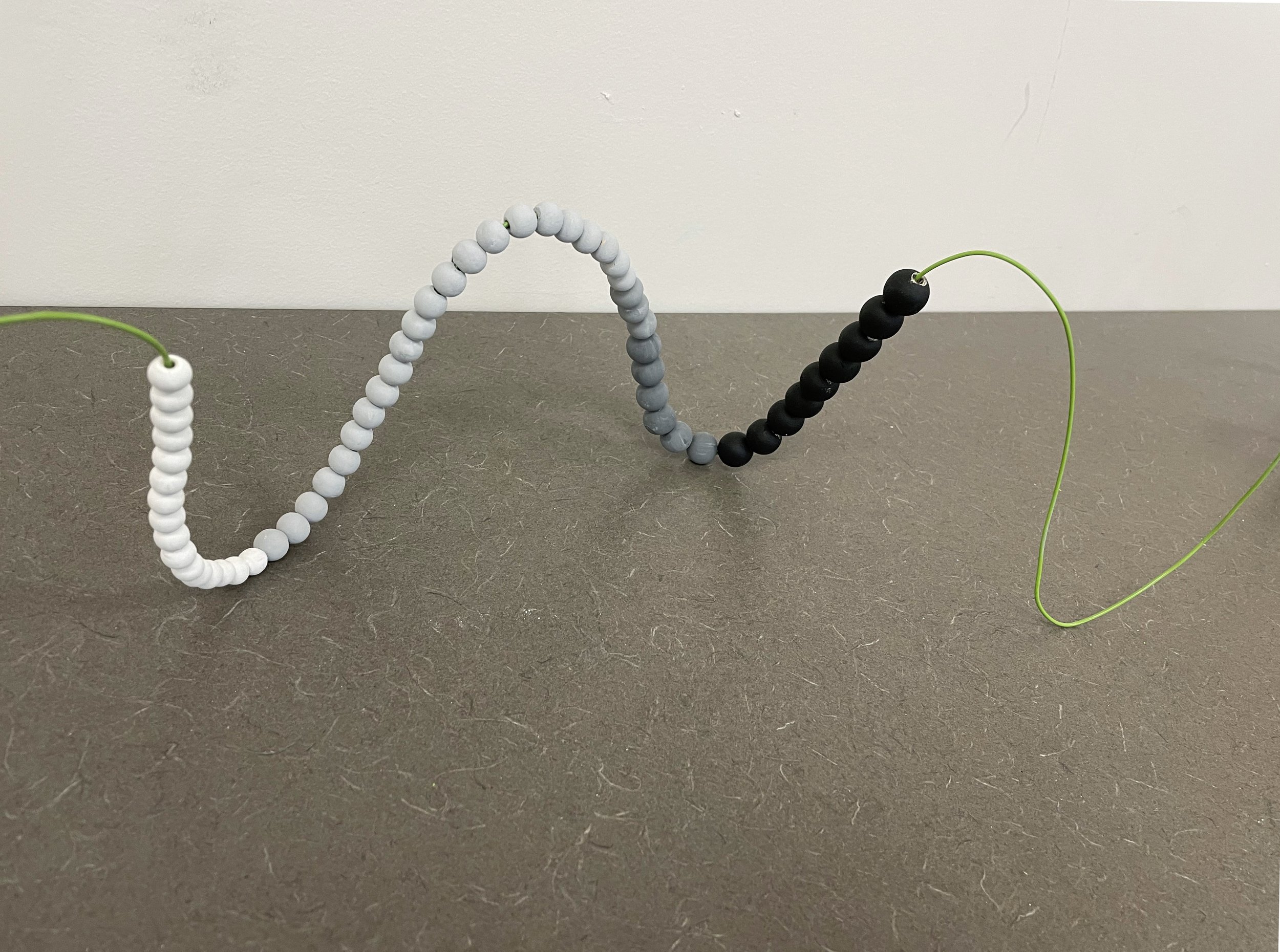
A Witness to Art: Who Goes to Art Museums? Using Art-Based Research to Explore Museum Demographics: This art education research analyzed art museum visitor demographics using participatory data visualization in collaboration with museum education programs. It is no secret that due to factors like the cost of museum admission, hours of operation, and limited locations, many do not have access to visiting these institutions in person. Thus, if only a small percentage of Americans are visiting fine arts institutions, what characteristics might these people share, and who is missing? To analyze these queries, we proposed the following interactive method of data visualization for use in museum education programs to address exclusivity regarding who has access to art museums. To begin, museum-goers are invited to place grayscale coded beads representing the ‘Age’ of viewers into transparent green receptacles representing the demographic category of their ‘Socioeconomic Status’. As the beads are collected, the demographics of viewer-participants are revealed. After two weeks, the beads are retrieved from the tubes and strung in the form of an abacus by museum education staff and visitors. The form that the strung beads take is up to the maker. In this way, the visualized data serves as an apparatus for examining viewer demographic age and income data in dynamic, organic states. Using a hands-on approach to generate material data visualizations promotes ‘embodied learning’ and ‘body authority’, creating opportunities to rethink quantitative data. This approach aims to make art museums more accessible by highlighting inequalities as the visualizations demonstrate the diversity of populations actually attending museums versus self-reported statistics created by extrinsic organizations. This research is significant in that it can initiate discourses between communities and art museums, affording opportunities to discover motivations for seeing art dependent on viewers’ ability to afford the cost of entrance fees, and at what age museum exposure takes place.


EXAMPLES: experimental abacus designs / models / prototypes - wire, wooden beads
GOAL FOR VISUALIZATIONS:
By first collecting the data in the plexiglass tubes, and then spatially re-arranging the structure of the data set, this process creates an opportunity to have a relatively dynamic experience with data. By combining relational aesthetics and participatory art-based research (ABR), viewers are not only essential to building the data set but are also invited to experience the data as it is accumulated and jumbled, and subsequently clarified using the abacus format. This transmutation of data invites close looking at the relationship between age and income bracket, shedding light on who goes to the museum by exploring two key factors that affect ability and access.
Income vs. Age - Shade of green wire indicates the ‘Income Bracket’, grayscale beads indicate ‘Age Group’


Making DO: DIY Communities of Practice on Pinterest: Visualizing User Comment Data." 2021-23. Art-Based Research & Data Visualization (Graphic Design). Data Source: The Pinterest-DIY Data Set.
This graphic design research was conducted using mixed quantitative and qualitative methods, including descriptive statistics, sentiment analysis, and digital ethnography. The data set contains information from 500 DIY project “Pins” on Pinterest and was built using coded categories. To create these visualizations, user comments associated with top-rated DIY project “Pins” were arranged in concentric circles to examine interactions between Pinterest users in DIY communities of practice (CoPs) on the site. Seeing the comment text data in new typographical arrangements changes the way viewers interpret the data, encouraging close looking and critical thinking about DIY culture and practices on Pinterest.

“Performing Arts Research Lab (PeARL)
Re-Presents Arts Data in Space & Time.”
Abridged Artist Residency. China Academy of Art. 2019.


“What Petrifies You?” Isabella Stewart Gardner Museum, Boston, MA. 2016. Collaborative Project with Artist in Residence Cesare Pietroiusti.
This participatory data visualization features museum goers’ fears as images and/or text on small cards. Participants were invited to depict their fears, and the final arrangement was based on the museum’s central mosaic floor sourced from a 1st century Roman bathhouse. The arrangement of the tiles showcases an image of Medusa’s head.


“Statistical Likelihood of Shark Attack versus Death From Smoking-Related Illness.” Digital Object: Data Visualization of Search Engine Sourced Images. 2015.